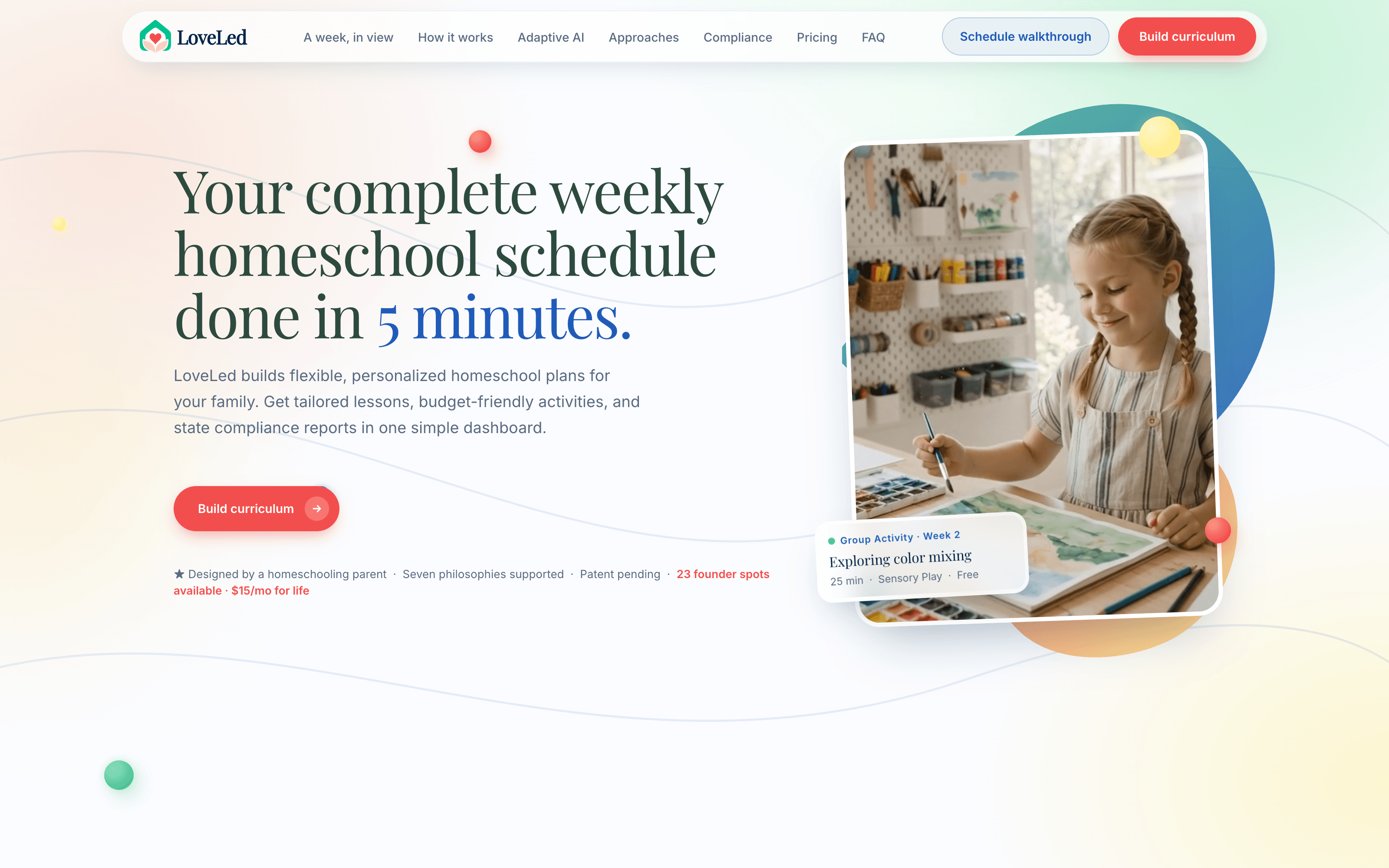
Homepage Demo — open on a desktop browser to use the live prototype.
AI Homeschool Planning
Homeschooling shouldn't feel like a second job. A planner that reads how your family actually teaches — then drafts the year, and keeps the state paperwork written as you go.
Love LedThe TL;DRLove Led is a philosophy-aware homeschool planner I designed and built end to end. A family answers eight questions — how they teach, who their kids are, what the week looks like, what the budget is — and the app drafts a full school year of lessons per child. Every lesson is editable, swappable and regeneratable, and the hours a parent ticks off quietly assemble into the state compliance report they would otherwise write by hand.
Planning Is the Second Job
A solo homeschooling parent spends three to five hours a week planning. Not teaching — planning. The tools that exist do not reduce that number, because they are shaped wrong for the problem.
Every tool draws the same grid
Notion templates, spreadsheets and paper planners produce an identical week whether the family is Montessori or Classical. They organise time. They understand nothing about how a family teaches, so the parent supplies all of the judgement.
Three chores, no connective tissue
Sourcing materials, logging hours and filing state compliance are three separate manual processes. The same lesson gets re-entered three times, in three places, for three different reasons.
No week survives Tuesday
A sick kid, a field trip, a bad morning — and the plan is wrong. Most schedulers offer drag-and-drop, which is a way of rebuilding the week by hand rather than a way of recovering from it.
Most families are eclectic
They mix methods per subject — Charlotte Mason for literature, something structured for maths. It is the most common real-world approach and the one almost no scheduler can represent at all.
The ChallengeHow might a planner understand a family's educational philosophy well enough to draft a year that actually looks like their teaching — and stay trustworthy while an AI does the drafting?
Method First, Then the Week
The whole product turns on one ordering decision: philosophy is question one, before subjects, before schedule, before the child's name. Everything downstream — lesson length, how much is parent-led, whether a subject arrives as a project or a worksheet — is derived from that answer. Three pillars carry it.
Philosophy-Aware Generation
The questionnaire opens on method, not on subjects. A Charlotte Mason week and a STEM week are different shapes — short lessons and nature study versus long project blocks — so philosophy is the first input the generator reads, not a tag applied afterwards.
A Plan That Survives Tuesday
Every lesson can be swapped for one of three alternatives, moved, or dropped, and a week can be regenerated without rebuilding the year. The plan is treated as a draft the parent edits, never as a schedule handed down.
Compliance as a By-Product
Hours, days in session and subjects covered accumulate from the same lessons the parent is already ticking off. By the time Pennsylvania asks for a portfolio, the record is already written — logging is not a second chore bolted onto the first.
Four Things I Got Wrong First
Building alone means no one talks you out of a bad idea before you ship it — you find out by using the thing. These four are the corrections that actually changed the product, each one a real reversal in the repo rather than a tidy story told afterwards.
Iteration 1
Materials that distributed themselves
The first materials feature let the AI silently spread a family's books and kits across the schedule — you add a maths manipulative, it lands in seven lessons. It worked, and it felt awful: you could not see what it had decided until you found it on a Tuesday. I replaced it with a manual configure wizard the parent drives, with the AI demoted to suggesting. Same lesson the TikTok agentic work landed on independently — an auto-decision without a review step reads as risk, not as help, even when it is correct.
Iteration 2
A loading screen that was too fast
The generation screen animates six steps while the model drafts a year of lessons. The first build ran quickly and carried a “One more minute” label. It read as glib — a parent is watching software decide their child's school year, and a snappy spinner made it feel like the plan was cheap. I slowed the loaders by 30% and removed the label, then later slowed the first four steps by another 50%. The rare case for deliberately making a UI take longer: instant undermined the thing it was doing.
Iteration 3
Multi-child arrived second
I built for one child and it was wrong on contact with real families — most have two or three, at different ages, mixing methods per kid. Multi-child onboarding and group activities came in as a distinct, later change, and reshaped the data model: each child carries their own philosophy, pace and start date, while the calendar has to express both the individual schedule and the things the family does together. Retro-fitting that was the most expensive correction here — and the clearest argument for the eclectic, multi-kid case being the default rather than the edge.
Iteration 4
The shell caught up with the app
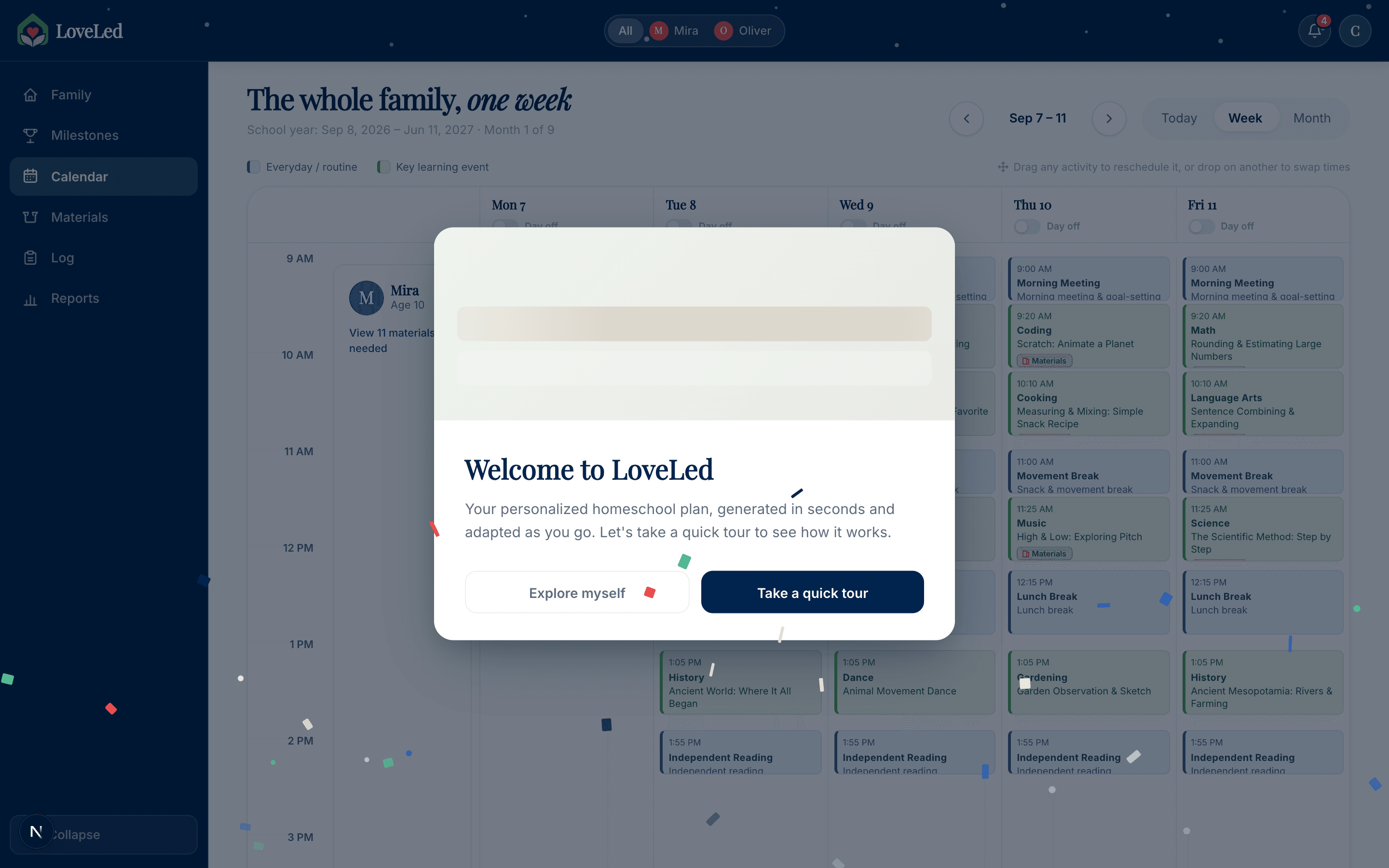
As Materials, Log, Reports and Milestones arrived, the full-width top bar ran out of room. It became a collapsible left sidebar with only kids and account left up top — the horizontal axis was never going to keep scaling. In the same stretch, onboarding gained a full-screen welcome modal with an animated schedule demo and shimmer-reveal cards, because asking for eight questions before showing anything was asking for trust I had not earned yet. Sell the outcome, then ask.
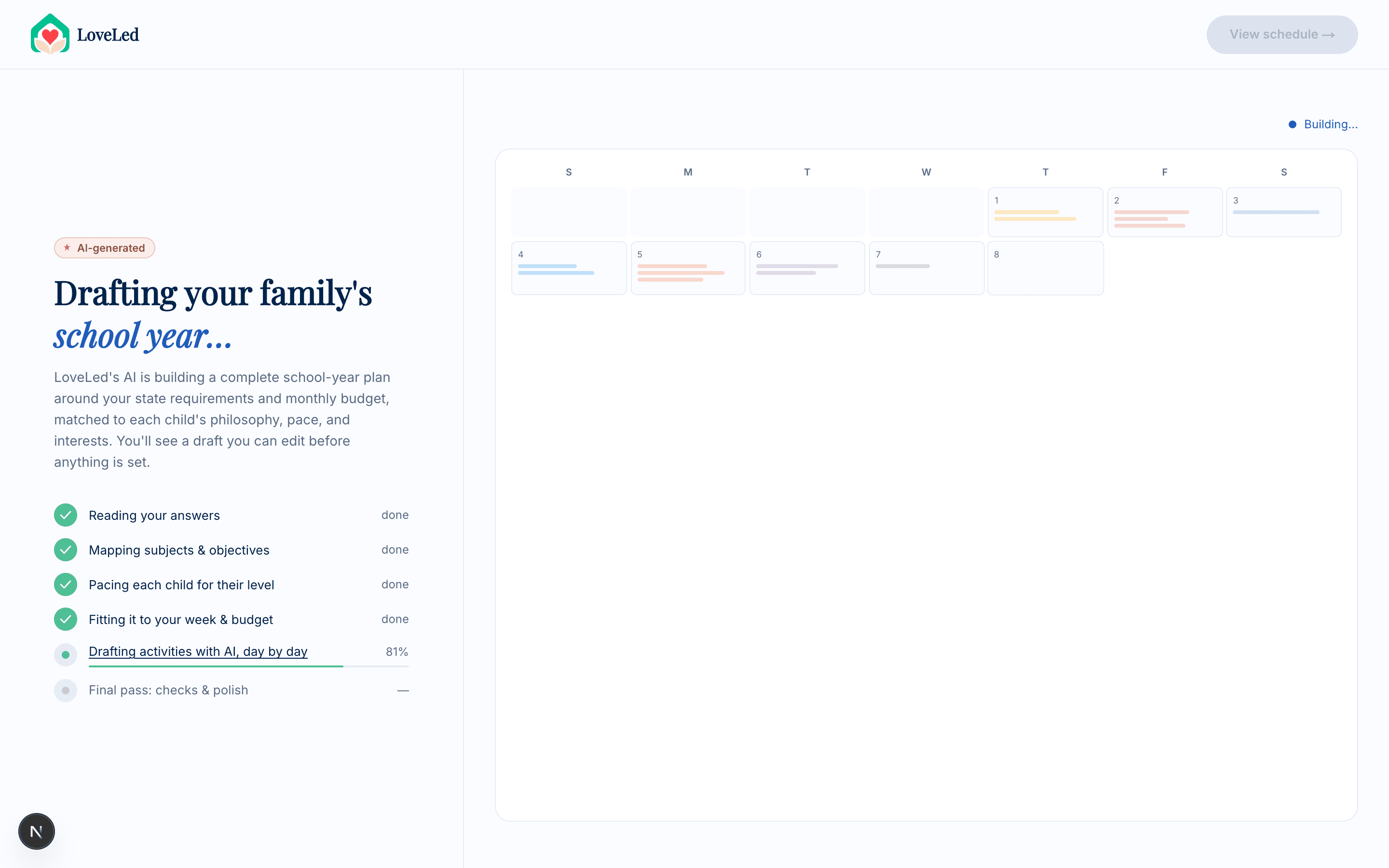
A · Generation, Made Watchable
The generation screen is the moment the product either earns trust or loses it. Rather than a spinner, the left column names what the model is doing in the family's own terms — pacing each child for their level, fitting it to your week and budget — while the right column fills a live calendar in step with it, cells zooming in and subject bars growing as the plan is drafted. It is a GSAP timeline deliberately paced to the work, not to the wait.
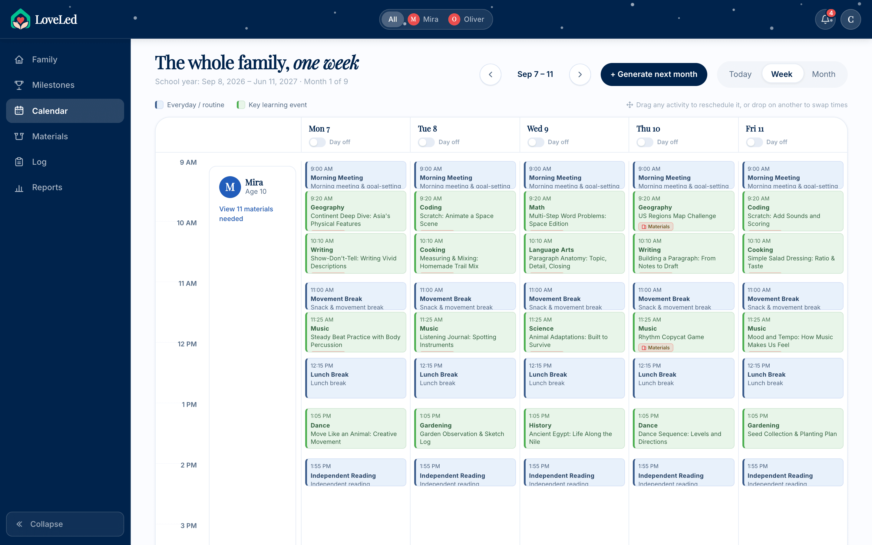
B · The Week, and the Day Inside It
Three views of the same plan. Week is the working view — a Mon–Fri grid where colour separates a key learning event from an everyday routine, and any card can be dragged to reschedule or dropped onto another to swap times. Todaynarrows to one day as a list with completion state, a swap button on every row, and a stats rail that answers “how much is on me today?” — minutes scheduled, how many are parent-led. Month is the zoom-out for pacing.
C · Swap, Because Tuesday Happens
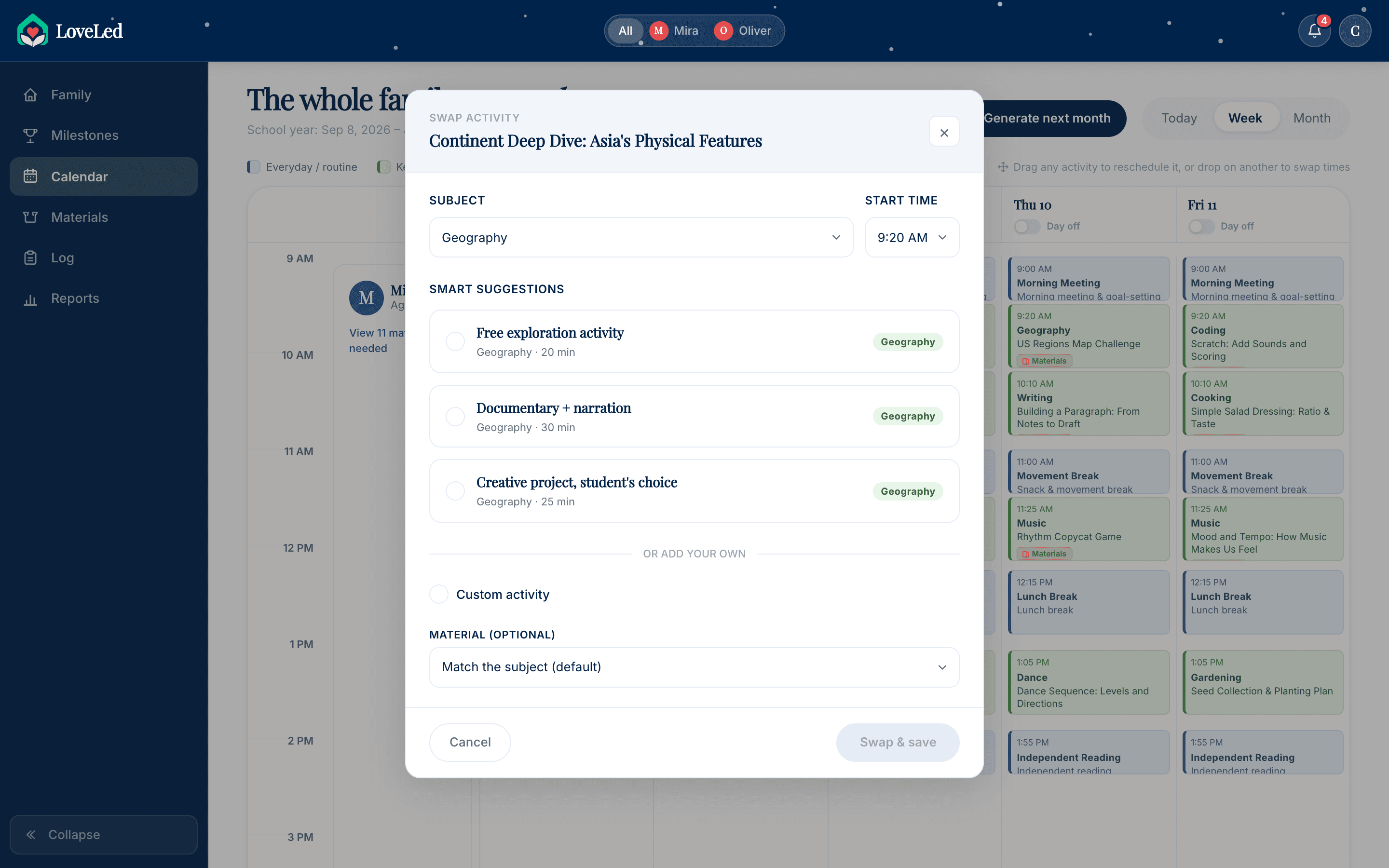
The swap dialog is the answer to “the plan is wrong now.” It offers three alternatives in the same subject, each with its real duration, so a 40-minute block can become a 20-minute fluency game on a bad morning. Below them sits a custom-activity escape hatch and an optional material override. Crucially the parent picks — the AI narrows the field to three sensible options and then stops. This is the same supervised-autonomy line the materials rollback drew: the system proposes, the person disposes.
D · The Family View
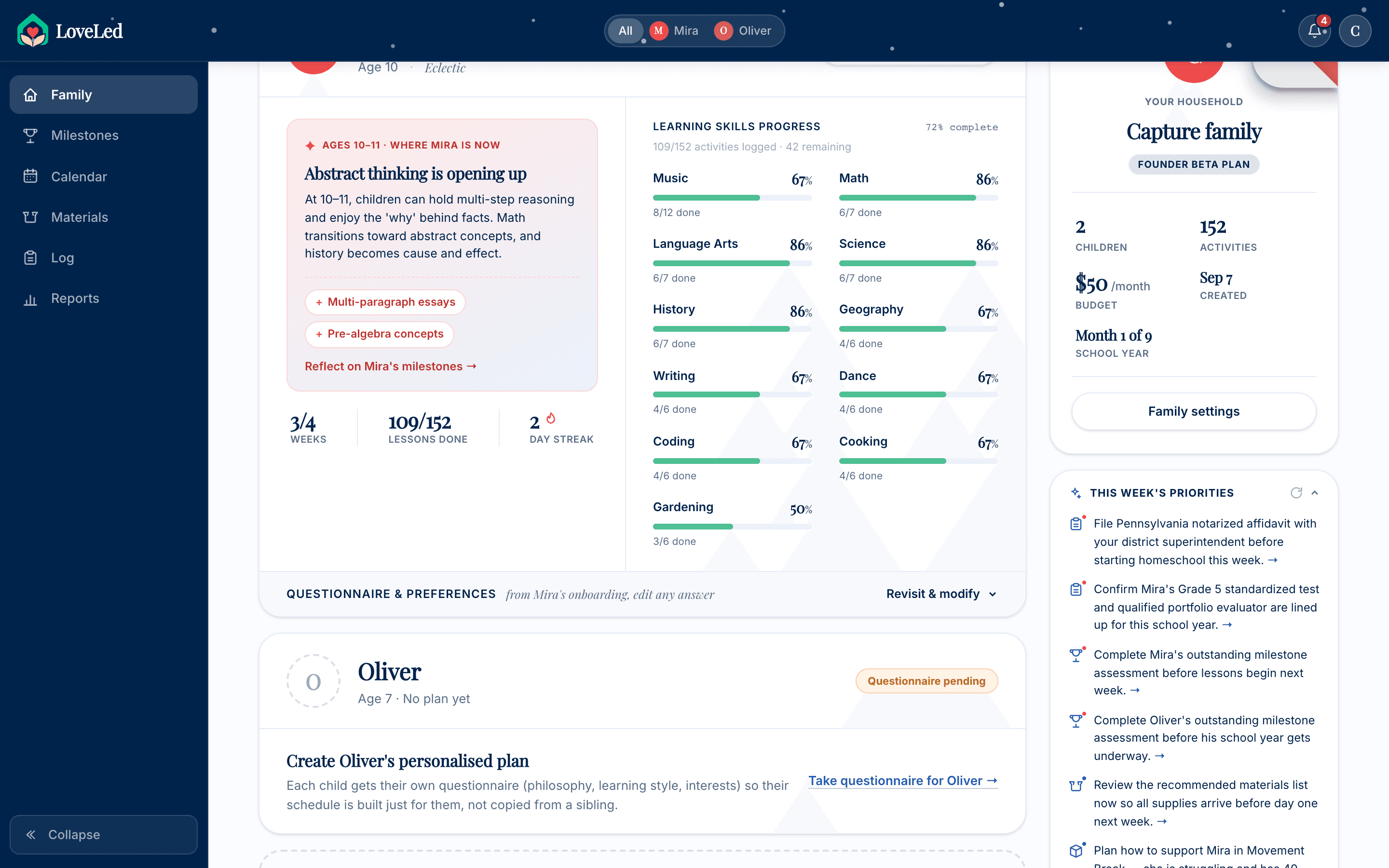
The dashboard answers a different question from the calendar: not what is today but is this working. Each child gets a developmental insight card banded to their age — at 10–11, abstract thinking is opening up — next to subject progress bars drawn from lessons actually logged. Every onboarding answer stays editable here, and changing one reshapes the affected schedule rather than requiring a fresh start. Oliver sits below Mira with a questionnaire-pending state, because a sibling gets his own eight questions rather than a copy of hers.
E · Logging, and the Report That Writes Itself
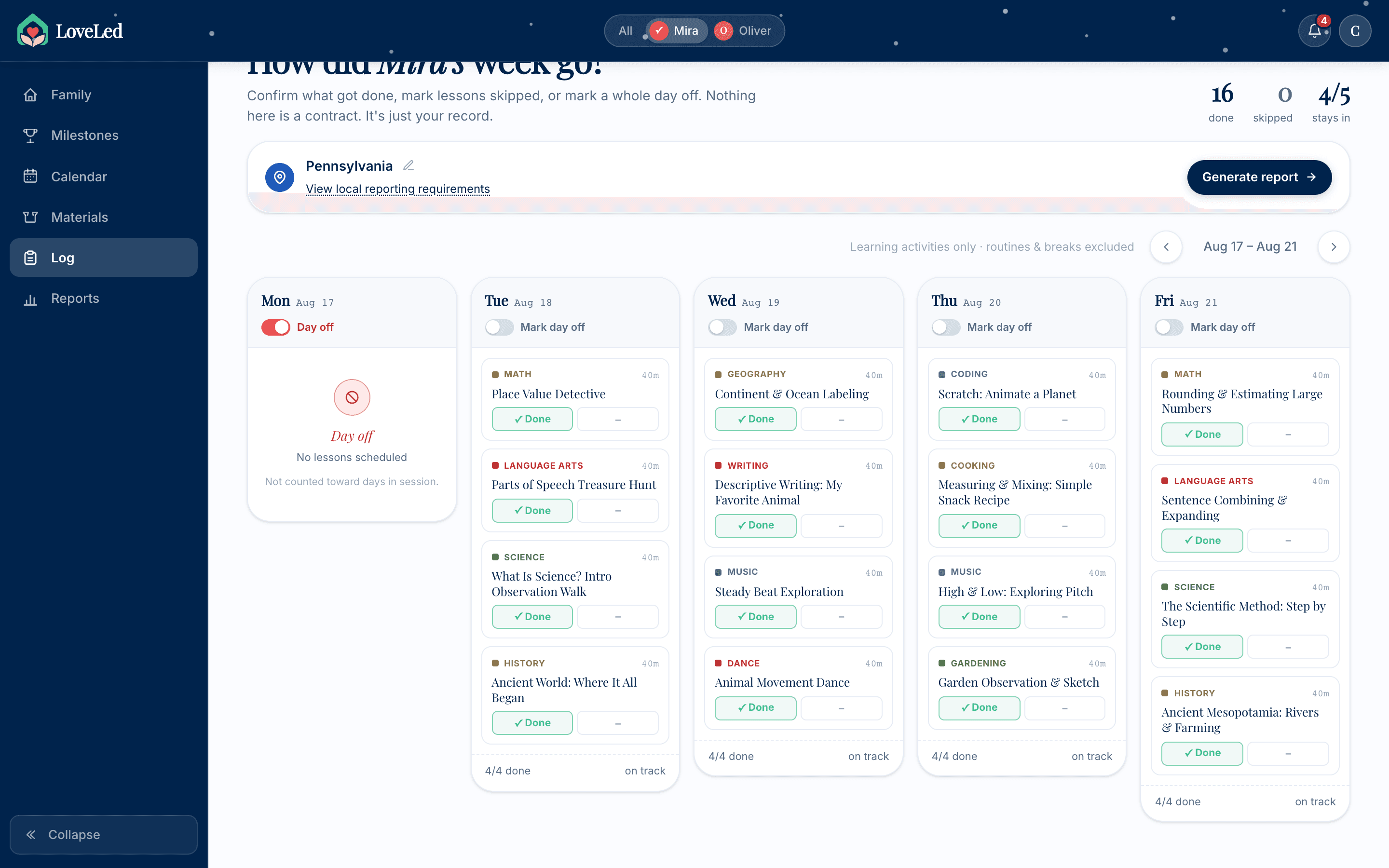
The Friday review shows the week as five columns of learning activities — routines and breaks deliberately excluded, so the parent only confirms what counts toward instruction hours. Marking a week done feeds the records archive, where each week carries its hours, days active, subjects covered and a filed-or-draft state. The stats at the top are the ones Pennsylvania asks for: days in session against the required 180, instruction hours, reports filed. Nothing here is a separate data-entry chore; it is the same ticks, counted.
F · Materials, After the Rollback
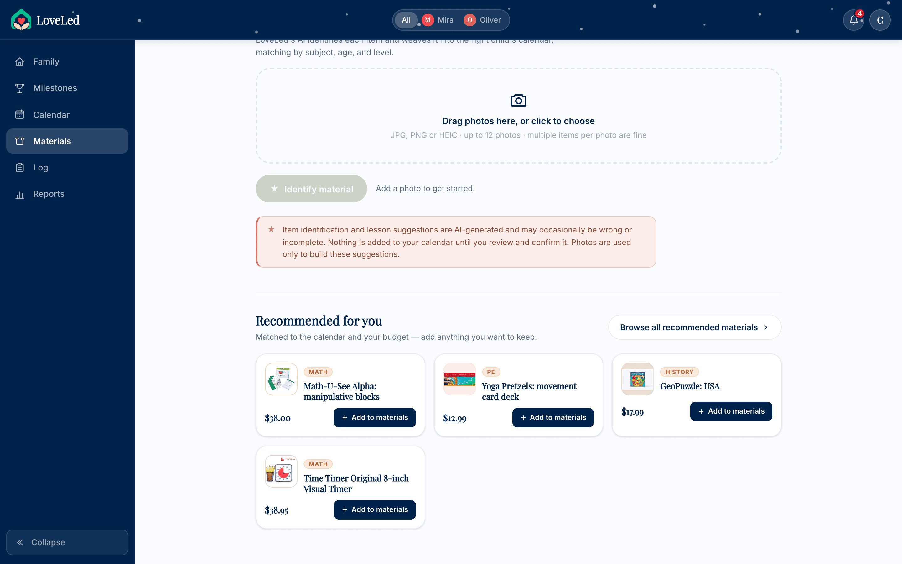
This is the screen Iteration 1 produced. Recommendations are matched to the calendar and the stated budget, but every one of them sits behind an explicit Add to materials. The photo scanner will identify a shelf of books and kits and propose where they fit — and the notice under it says plainly that nothing reaches the calendar until the parent reviews and confirms it. Writing that sentence into the UI was the point of the rollback.
Still in Beta, and Saying So
Love Led is in developer beta — functional end to end, from onboarding through generation, calendar, logging and compliance, with 23 founder seats at $15/mo locked in for life. I am not going to put an adoption curve on this page. It is a product I built alone and it has not earned those numbers yet.
What it has earned is a clear read on which design decision matters most: philosophy-aware generation is the differentiator, and it is the one thing a generic planner structurally cannot copy. Any tool can draw a week. Producing a week that looks like a Waldorf week — blocks, rhythm, no screens — and a different one for the Classical family down the road requires the method to be an input to generation rather than a label on the output. That single ordering decision is why the product exists.
The second thing I would carry anywhere is the pattern I hit twice, from opposite directions. The materials auto-distribute felt unsafe because the AI acted without a review step. The generation screen felt unsafe because it acted too quickly to seem considered. Both were fixed by putting a visible, appropriately-paced human moment back into an automated flow — supervised autonomy, the same conclusion the TikTok agentic work reached with a team of twelve behind it. Apparently it does not matter how big the team is: people will not hand over judgement to something that will not show its work.